
Color is one of the most powerful tools in an artist's arsenal. It can evoke emotions, create focal points, establish harmony, and communicate meaning. Yet many artists rely solely on intuition when selecting colors, missing the opportunity to harness the full potential of this fundamental element. Understanding color theory provides a framework for making informed decisions that enhance your artistic vision. In this comprehensive guide, we'll explore the essential principles of color theory that will transform your approach to color in your artwork.
The Building Blocks: Color Properties
Before delving into color relationships, it's essential to understand the three primary properties of color:
Hue
Hue refers to the pure color itself—red, blue, yellow, etc. It's what we typically mean when we say "color." Hues are the colors found on the traditional color wheel, which we'll explore in more detail shortly.
Value
Value describes the lightness or darkness of a color. Adding white to a hue creates a tint (making it lighter), while adding black creates a shade (making it darker). Value is crucial for creating depth, contrast, and focus in your artwork.
Saturation (Chroma)
Saturation refers to the intensity or purity of a color. Highly saturated colors appear vibrant and intense, while desaturated colors appear more muted, grayish, or neutral. Controlling saturation helps establish mood and direct attention in your compositions.
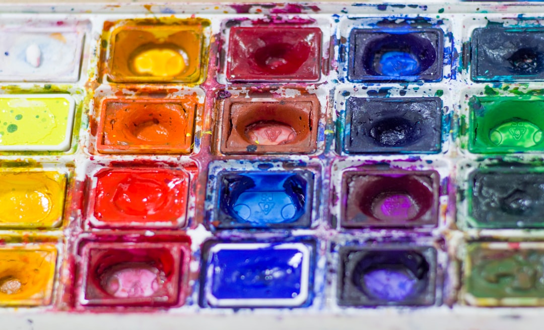
Diagram illustrating the three properties of color: hue, value, and saturation
The Color Wheel: Understanding Color Relationships
The color wheel is a visual organization of colors that helps us understand how they relate to one another. The traditional artists' color wheel consists of 12 colors:
Primary Colors
In traditional color theory, the primary colors are red, yellow, and blue. These three colors cannot be created by mixing other colors and form the basis for all other colors on the wheel.
Secondary Colors
Secondary colors are created by mixing two primary colors in equal amounts:
- Red + Yellow = Orange
- Yellow + Blue = Green
- Blue + Red = Purple
Tertiary Colors
Tertiary colors are created by mixing a primary color with an adjacent secondary color. These include:
- Red-Orange
- Yellow-Orange
- Yellow-Green
- Blue-Green
- Blue-Purple
- Red-Purple
Note on Color Systems
While traditional artists typically use the RYB (Red-Yellow-Blue) color model, other systems exist. Printers use CMYK (Cyan-Magenta-Yellow-Black), and digital screens use RGB (Red-Green-Blue). Each system has its own set of primary colors and mixing properties.
Color Harmonies: Creating Effective Color Schemes
Color harmonies are specific combinations of colors based on their positions on the color wheel. These provide reliable frameworks for creating balanced and visually appealing color schemes.
Complementary Colors
Complementary colors sit opposite each other on the color wheel (e.g., red and green, blue and orange, yellow and purple). These combinations create maximum contrast and can make elements stand out dramatically. When placed side by side, complementary colors appear more vibrant.
Best used for: Creating focal points, energetic compositions, and strong visual impact.
Caution: Full-strength complementary colors can create vibration when placed adjacent to each other. Consider using one color at full strength and the other as an accent, or slightly mute one or both colors.
Analogous Colors
Analogous color schemes use three to five colors that are adjacent to each other on the color wheel (e.g., blue, blue-green, and green). These create harmonious, comfortable compositions with low contrast.
Best used for: Creating unified, serene compositions or establishing a specific mood.
Tip: For greater visual interest, vary the value and saturation within your analogous palette and consider introducing a complementary accent color.

Examples of complementary and analogous color schemes in artwork
Triadic Colors
Triadic color schemes use three colors equally spaced around the color wheel (e.g., red, yellow, and blue). These provide high contrast while maintaining balance and color richness.
Best used for: Vibrant, balanced compositions with variety.
Tip: For a more cohesive look, consider using one color as dominant and the others as accents.
Split-Complementary Colors
This scheme uses a base color plus the two colors adjacent to its complement. For example, if your base color is blue, you would also use yellow-orange and red-orange (the colors adjacent to blue's complement, which is orange).
Best used for: Creating contrast with more variety and less tension than pure complementary schemes.
Monochromatic Colors
Monochromatic schemes use variations in value and saturation of a single hue. These create cohesive, unified compositions.
Best used for: Subtle, sophisticated works with emphasis on form and texture rather than color contrast.
Tip: Create interest through strong value contrasts within your chosen hue.
Color Temperature: Warm vs. Cool
Colors are often described as either "warm" or "cool":
- Warm colors (reds, oranges, yellows) tend to advance in space, create energy, and evoke feelings of warmth or excitement.
- Cool colors (blues, greens, purples) tend to recede in space, create calm, and evoke feelings of serenity or melancholy.
Understanding temperature allows you to:
- Create depth by placing warm colors in the foreground and cool colors in the background
- Establish mood and atmosphere
- Create temperature contrast for visual interest
Color Context: The Relativity of Color
Perhaps the most fascinating aspect of color theory is how colors influence one another when placed in proximity. As demonstrated by color theorist Josef Albers, the same color can appear dramatically different depending on its surrounding colors.
Key Principles of Color Context:
- Colors appear lighter when placed against darker backgrounds and darker when placed against lighter backgrounds
- Colors appear more vibrant when placed against their complementary color
- Colors can appear to shift in hue based on surrounding colors
- The larger the area of a color, the more intense it appears
Understanding these effects allows you to create optical illusions, vibrating boundaries, and subtle color harmonies in your work.

Examples of how the same color appears different depending on surrounding colors
Psychological and Cultural Aspects of Color
Colors carry psychological associations and cultural meanings that can enhance your artistic message:
Common Psychological Associations:
- Red: Passion, energy, danger, power
- Blue: Calm, trust, stability, depth
- Yellow: Optimism, clarity, warmth, caution
- Green: Growth, harmony, freshness, prosperity
- Purple: Creativity, royalty, wisdom, mystery
- Orange: Enthusiasm, creativity, determination
- Black: Sophistication, power, elegance, mystery
- White: Purity, cleanliness, simplicity, minimalism
Remember that color meanings can vary significantly across cultures. Research specific cultural contexts if your work addresses a particular cultural audience or theme.
Practical Application: Color Strategies for Artists
Creating Focus Through Color
- Use higher saturation for focal points and lower saturation for supporting elements
- Place complementary colors at points of emphasis
- Create contrast through temperature (a warm accent in a cool composition)
- Use value contrast to direct the viewer's eye
Establishing Mood and Atmosphere
- Consider temperature: warm palettes for energetic or intimate scenes, cool palettes for calm or distant feelings
- Adjust saturation: vibrant colors for joyful or intense moods, muted colors for melancholy or subtle moods
- Create unity through limited palettes
Developing a Personal Color Palette
Many successful artists develop signature color palettes that become part of their artistic identity. Consider:
- Creating a limited palette of 5-7 colors that work well together
- Testing how these colors mix to produce a wider range of hues
- Documenting your palette for consistency across works
- Allowing your palette to evolve as your work develops
Color Mixing in Different Media
Different artistic media follow different color mixing principles:
Pigment-Based Media (Paint, Ink, etc.)
These follow subtractive color mixing principles. Key considerations include:
- Primary colors mix to create darker colors
- All colors mixed together approach black or dark brown
- Specific pigments have unique mixing properties
- Opaque vs. transparent qualities affect layering
Light-Based Media (Digital, Projection)
These follow additive color mixing principles:
- Primary colors (red, green, blue) mix to create lighter colors
- All colors at full intensity create white
- Absence of all color creates black
Color theory provides a framework for understanding and using color effectively, but it's not a rigid set of rules. The most successful artists combine theoretical knowledge with intuition and experimentation. As you apply these principles, remember that deliberate departures from traditional harmonies can create exciting and unexpected results. Begin with a solid understanding of color relationships, then allow your unique artistic vision to guide how you implement, adapt, or challenge these concepts in your work. With practice, you'll develop a nuanced understanding of color that will become an intuitive part of your creative process.

Comments (2)
Lisa Chen
May 6, 2023This is exactly what I've been looking for! I've always relied on intuition for color choices, but understanding the theory behind it makes so much sense. The section on color context was particularly eye-opening - I'll be much more conscious of how surrounding colors affect perception now.
David Wright
May 8, 2023Great article! I'd add that for painters working with physical pigments, it's worth noting that not all paint colors behave according to ideal color theory. Some pigments have unique properties that can produce unexpected results when mixed. For example, cadmium red and phthalo blue might not mix to create the exact purple you'd expect from the color wheel.
Michael Rodriguez
May 8, 2023Excellent point, David! You're absolutely right that real-world pigments don't always follow theoretical color mixing perfectly. I'm planning a follow-up article specifically about pigment behavior and how to create a practical mixing chart for your specific palette. Thanks for bringing this up!
Leave a Comment